(Ashmolean Museum, Oxford, until 18 August 2013)
The Ashmolean Museum’s collection of Old Master drawings began with a bang in 1843 when the newly-fledged institution managed to acquire a group of Raphael and Michelangelo drawings from the collection of the late Sir Thomas Lawrence. Sheets by Rembrandt, Leonardo and Claude followed in 1855, as part of a bequest from the collector Chambers Hall and further Northern drawings were added in 1863 from the collection of the antiquarian and connoisseur Francis Douce. By having had the good fortune to be founded at a time when it was still possible to purchase great sheets by the Old Masters, the Ashmolean has built up one of the greatest collections of drawings in the country.
Tastes have fluctuated over the years – few people nowadays would agree with Ruskin’s polemical speech in 1873 in which he criticised the draughtsmanship of Claude and Raphael, and dismissed Michelangelo as appealing ‘to comparatively weak and pedantic persons‘ – but these differing foci have resulted in a collection which has examples of fantastic drawings from every school and every period. The present exhibition is very much a ‘best of’ show, but I can’t imagine that anyone would have the temerity to complain about a lack of focus when it gives us the chance to see so many fabulous things – including an absolutely stunning Raphael.
The first room of the exhibition, which is little more than a passageway (and feels very cramped: see below), focuses on works from the 15th and 16th-century Northern schools, from Matthias Grünewald’s gnarled Elderly Woman with Clasped Hands, in which every wiry stroke of chalk defines a curve, building up a powerful sense of volume, to Holbein’s watercolour of A Young Englishwoman, not much bigger than a playing card, in which he faithfully records every detail of her early 16th-century costume. For me, the most striking thing in this room was the Lucas van Leyden St Jerome. Not only was it on a surprisingly large scale (in fact, many of the drawings I knew well from photographs surprised me by their size), it was also executed with incredible finesse. The saint is shown against a vivid blue background, very simple, which offsets the intricate penwork in his face and beard, and on the skull in the foreground. Contours are picked out with delicate strokes of white heightening which help to define the forehead and nose, and suggest Jerome’s beetling eyebrows. It was a very impressive drawing. This first room finishes off with three works by Rubens, each showing a different aspect of his art: a portrait (of the Earl of Arundel); a landscape; and the famous figure study for his Deposition from the Cross.


The main gallery displays drawings from the Italian schools, along with works by Rembrandt, British artists and a selection of more modern works on paper. In defiance of Ruskin, I marvelled at the conviction of Michelangelo’s figure studies: at the swift but utterly convincing studies of a Sibyl’s hand and a turning youth for the Sistine Chapel ceiling, or the softer, smoother Ideal Head. The Head of a Girl by Carpaccio on blue paper was another pleasant surprise, showing the artist’s skill at modelling the structure of the face through fine lines of brown wash combined with strokes of white heightening. Leonardo’s Maiden with a Unicorn is a particular personal favourite, and probably the only drawing where I’m always surprised by how small it is: it has such a serene and chivalric flavour, quite devoid of the turbulence and restlessness that characterises so much of Leonardo’s draughtsmanship. Nearby was the supposed Self Portrait of a young Raphael, which I stood in front of for quite a long time, savouring its freshness and simplicity; and I had just decided that it was going to be one of the stars of the day when I saw what was coming up next. And, forgive me, but the Self Portrait was utterly eclipsed.
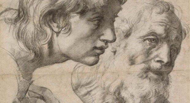
To be fair to Raphael, it was eclipsed by another of his drawings: the auxiliary cartoon of Two Apostles for the Transfiguration, which is categorically the most beautiful Raphael drawing I’ve seen. It takes your breath away. I have seen it before, but long enough ago that I’d forgotten its scale and power. Executed in rich black chalk, it’s in incredible condition and all the more wonderful for the shadowy pounced lines which show where the composition was transferred onto another sheet, ready for addition to the painting itself. The light comes strongly from behind the young apostle, so that his shadowed profile stands out against the brightly-lit head of the older man, and the fall of light allows Raphael to define the veins and creases on the old man’s neck and the soft wrinkles in the sagging skin around his eyes. Even the difficult foreshortening of the hands is carried off well (the hand on the right slightly better than that on the left, perhaps). And it goes beyond representational brilliance to suggest the psychology of the two figures: the young man’s simple faith and wonder, coupled with the consternation and surprise of the older apostle. It is an astounding drawing and easily worth the entrance fee by itself. I’ve always had a soft spot for Raphael’s drawings and this only confirms for me what a superb draughtsman he is.


After that, of course, everything else suffered slightly by comparison, but there were other wonderful things: the Rembrandts, of course, and one of Giovanni Battista Tiepolo’s striking head studies in red chalk on blue paper. Among the British drawings was a Blake illustration to Dante’s Paradiso, which I actually rather liked for once (I have complex feelings about Blake), and also Samuel Palmer’s remarkable and uncompromising Self Portrait, in which the young artist stares fixedly out at the viewer, almost challenging us. The modern works on paper included a couple of things which particularly struck me. To my surprise, I found Antony Gormley’s Learning to Be a rather moving image: a characteristically solitary male figure, silhouetted against an expanse of empty earth and sky, apparently helpless before the elements, and yet at the same time somehow totemic, his arms hanging down by his sides like an ancient kouros. And the exhibition rounded off with David Hockney’s drawing of Henry Writing, Lucca, August 1973, in which the artist’s curator friend is shown frowning over his typewriter, his fingers poised optimistically over the keys as he (apparently) wrestles with the next line: it’s a sprightly, free and affectionate image, which left me smiling.
While the contents of the exhibition are wonderful, there were a couple of things about the display which I felt could have been improved. The ambient lighting was very dim, with good reason of course, and each of the drawings was lit by a spotlight above; but several of these spotlights were in the wrong position, meaning that you couldn’t lean close to examine the drawing or read the label without casting the whole thing into your own shadow. This is a particular problem with exhibitions of works on paper, because of course with paintings you would naturally stand further back and the issue wouldn’t even arise; but it’s something that must be easy to fix. My other point is less easy to fix, because it has to do with the very structure of the rooms used for the exhibition. This show is displayed in the same suite that was used for the Guercino drawings exhibition last year (which I never got around to posting about): I thought then, and I think now, that the first room of the exhibition is desperately cramped and feels a tiny bit like a broom cupboard, which you have to shuffle through in order to reach the larger gallery beyond the bridge. There isn’t really space to stand and appreciate the drawings, because you find yourself always having to move so that people can get past you. This first room slightly gives the impression that drawings are the poor relations, a feeling emphasised on this particular trip by the fact that, every few minutes, there would be a blast of sudden violin music from the introductory film for the Stradivarius exhibition in the neighbouring room.
This is not to take away from the exhibits themselves, however, and Master Drawings is a welcome addition to a recent string of really great Old Master drawings shows. If you can get to Oxford between now and August, do your best to see it. Once it’s over, then everything will be stored away back in the Print Room away from public view (though of course you can always make an appointment to go and see the drawings there; but seeing the exhibition is much easier!). If you do go, come back and tell me which of the drawings were your favourites.


Hello Michael! To do them justice, they do have an information board at the beginning of the exhibition with an overview of the collection's history, plus there's an opening essay in the catalogue on the way in which the collection was formed. It might have been interesting, however, to have had the drawings arranged by purchase date rather than school / execution date. That would have shown very clearly how the museum's collecting activity developed and which curators were responsible for which acquisitions – offering an interesting parallel narrative about the history of taste and expanding on the comments made on the info board and in the catalogue essay.
While I agree that 'greatest hits' shows aren't the most original idea, I still feel that they can be a great way to capture the imagination of visitors who don't know a lot about drawings already. For those of us with a little more knowledge, it's a chance to familiarise ourselves with things that perhaps we only know from photographs, or to be introduced to works on paper outside of our usual areas of focus. In this particular case, it's all tied in with the relaunching of the museum, and it'll be interesting to see what sorts of drawings exhibitions the Ashmolean put on in the future – I should imagine that with a collection like that to draw on, they could come up with some real gems.
Completely share your view of the Raphael, which I saw recently. I've put off visiting this show because I was a bit nervous of the display, and you confirm some of my fears. It's a terrific collection, but I can't help thinking a 'greatest hits' exhibition is a bit unimaginative. One thing I'm especially interested in is the history of the collection – the great collectors you mention, and the amazing curator Karl Parker. Maybe that could have given it a better focus, but still allowed display of these wonderful highlights.