(Dulwich Picture Gallery, until 15 November 2015)
This year there are many exhibitions designed to capitalise on the sudden flourish of enthusiasm for all things Waterloo and Napoleon. This small show at Dulwich shrewdly uses the Bonaparte connection as an excuse for bringing a little-known artist back into the limelight, and bravo to that. I say ‘little-known’ with some caution. Having spent far too long in the art world, I sometimes find it hard to judge how familiar an artist would be to the average passer-by on Oxford Street; but I think I’m safe in assuming that Prud’hon isn’t exactly a household name.
That’s largely because we don’t have much of Prud’hon’s work on view in our national collections. For example, the British Museum has two of his drawings, and the Fitzwilliam in Cambridge has another drawing and a painting, but generally it’s pretty sparse. By comparison there are 173 of his drawings at the Louvre, showing the full range of his activities as painter and designer. The Dulwich exhibition draws on another French collection: the Musée Baron Martin in Gray in eastern France, where Prud’hon lived for a while. The museum has lent twelve of its figure studies and, displayed alongside the British Museum’s Female nude, they make a petite but well-proportioned show.
So who was this mysterious chap with the exotic-looking surname? His name wasn’t actually Prud’hon at all: it was the more prosaic Prudon, and he was the son of a Burgundian stonecutter. But the young man had talent and an eye for an opportunity: when a local sponsor arranged for him to study at the Ecole des Beaux-Arts in Dijon, Prud’hon changed his name (adding the enigmatic apostrophe to his surname and adopting ‘Paul’ as a second first name, in honour of Rubens) and took every chance he could. Later he studied in Paris; and then in 1784 he won the Prix de Rome in Dijon. This was effectively a grant which allowed a young artist to live and study at the French Academy in Rome. Prud’hon was there for four years, at the same time as Jacques-Louis David, and although he was influenced by the same classical themes and forms that David made so central to his work, Prud’hon took a different tack. For David, classical history offered models of stern, uncompromising virtue, and his paintings were intended as moral exemplars for a new age of Republics and Empires. But Prud’hon balked at this kind of cold severity. His artistic spirit was softer and gentler, tending towards love stories or dramatic moments of emotion, and the style of his draughtsmanship had a similar quality.


Although he didn’t have an immediate success on his return to Paris – there simply weren’t many opportunities – Prud’hon did begin to receive commissions when the fire of the Revolution had settled into Republicanism. One of his biggest decorative schemes was for the Hotel de Lannoy in Paris, where the theme was wealth supporting the arts; but throughout the designs there is another, darker message: time brings all things to an end. Wealth might glitter in the present, but in Prud’hon’s paintings the Fates lurked in the corners, measuring out their thread, and ominous faces gazed down from the walls. There were a couple of preparatory drawings for this commission in the exhibition, which it was wonderful to see; I’ll come back to them in a minute.
Schemes like this made Prud’hon’s name and before long he had caught the attention of the most powerful man in France: Napoleon himself. It was the beginning of a fruitful relationship for the artist, who was commissioned to produce all manner of works, from decorative paintings to furniture designs, portraits (most notably of Napoleon’s first wife Josephine) and even event planning: he designed the celebrations to mark the Emperor’s second marriage in 1810. His honours came to a climax with the Légion d’honneur; and yet, for all this, Prud’hon seems to have had a trait of melancholy that never quite went away. He’d kept himself to himself in Rome, claiming he didn’t want his style to be affected by that of others; and for all his commissions he never really seems to have enjoyed painting. The greatest happiness of his life was his affair with his pupil Constance Mayer, with whom he collaborated for more than twenty years; but then she tragically committed suicide and Prud’hon, worn out by life, died just a couple of years later.
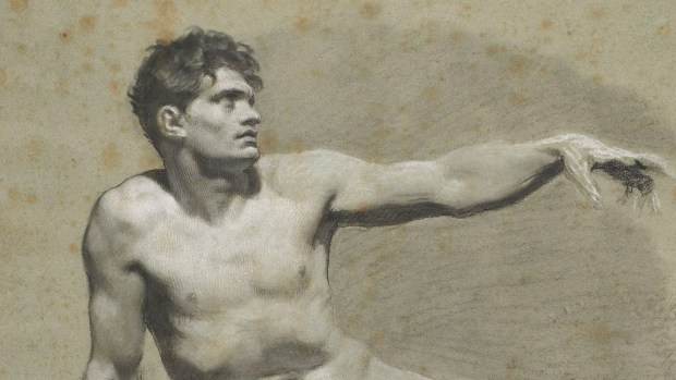
You can easily recognise Prud’hon. I became fond of his drawings precisely because they are so recognisable: coming across one, I could breathe a sigh of relief (‘I know this one!’). His figure studies are especially characteristic: drawn on blue paper in black and white chalk, they use blending and hatching to create a soft, voluptuous three-dimensionality. Sometimes Prud’hon goes one step further and uses a stump – the blunt end of a little cigarette-shaped roll of cloth – to blur the chalk even further into hazy shadows. As a final touch he adds daring strokes of white chalk which suggest the fall of light. His figures all share a family resemblance: long noses; unruly curls; often a very slight smile curving the corners of the lips; soft, androgynous bodies. There is usually a dreamy, languorous quality about them, epitomised in a study for Innocence choosing Love over Wealth (c.1804), in which a young girl snuggles up to a simpering adolescent Cupid, rejecting the jewels offered to her by a stately Roman matron.


But one of the drawings in this show makes the point that it wasn’t always so. This study for Aeneas and Creusa (1800) is a veritable swirl of movement, energetically dashed off. The young hero is caught in the act of turning from the altar; his wife Creusa kneels before him, supporting their infant son Ascanius, begging him not to go out to fight the Greeks. It was good to have something a little out of the ordinary to savour. The same went for the striking Old age (1798-1801), which was a study for the Hotel de Lannoy scheme. With none of Prud’hon’s usual sweet softness, this wrinkled visage stares grimly and ominously out at us, a handkerchief tied corpse-like under its chin. It’s an eerie image and the technique is different too: the chalk practically prickles off the page.
But the figure studies remain key and here there is a mixture of academic studies – the drawings made from the nude model which were the first step for any classically-trained artist at this period – and more advanced studies in which the figures are already draped and posed and coming closer to the final design of the painting. I was especially pleased to see the large three-part study for the painting of The Fates (1798-1801) at the Hotel de Lannoy. The three figures are creatively arranged in a long, low composition. Clotho, spinning the thread at far left, is the most beautiful; and her head, with its ethereal smile and mist of dark curls, is typical Prud’hon. Equally characteristic is the study of a young model as Paris (c.1800): a suitably effeminate young man with pretty dark curls and a Phrygian cap on his head.
But for me the highlight of the show was the drawing on the poster and the front of the catalogue, which I hadn’t seen before. This figure study (1810-1820) shows a young model, probably posing as a St Sebastian, slumped forward with one arm bound above his head. The sheer quality of the execution is stunning. The chalk is handled with remarkable delicacy, the blacks brushed into a smoky shade on the paper, the white highlights flicking over the figure, and the faded blue paper itself giving a mid-tone. Ironically the fading of the sheet, which is now an undecided blue-brown, offers its own flesh tint to the drawing, which works rather well. It’s a beauty.
Prud’hon wasn’t the most varied artist, it’s true, and nor was he the most searingly brilliant or original, but he deserves to be a little better-known than he is. This Dulwich show is certainly a step in the right direction. The catalogue is really more of a booklet, with reproductions of the drawings but only a brief text: if you’d like to find out more about him, the best place to start is probably the catalogue of a dedicated exhibition held at the Grand Palais in Paris and the Met in New York in 1997-98 – if you can find it for a decent price.


Lovely post. 🙂 You know I'm a great admirer of your blog in general and enjoy everything you write, but reading this post on Proud'hon I can't help but feel that there is that extra bit of smoldering enthusiasm when you write about the visual arts which gives your writing that particularly intense glow which your posts on books or opera – as great as those are – don't quite achieve. Or maybe it just looks that way to someone who is admittedly totally clueless when it comes to visual arts. 😛
Aw, thank you. I certainly feel more confident when writing about this. This is my home turf: I know that I'm coming from a position of relative strength, which I certainly don't feel when I write about opera, where I'm conscious that virtually everyone who reads it knows more than me, and I'm always nervous someone will turn round and point out the major thing I've failed to understand. But with old master drawings, I'm happily in my comfort zone. And considering my job, it's probably a very good thing that you feel I come across as enthusiastic when I'm writing about them. 😉 There are a couple more posts on small but worthwhile exhibitions coming up soon (one on drawings, one not), when I have time to sit down and write them.